Statewide Healthcare Data Dashboard
👤 Client: California Dept. of Health Care Services • 🎭 Role: Lead Developer • ⏳ Duration: 1 month (2023)
🧑💻 Tech: React, WordPress, Chart.js, PDF Generation, Government Compliance
⚡ Challenge
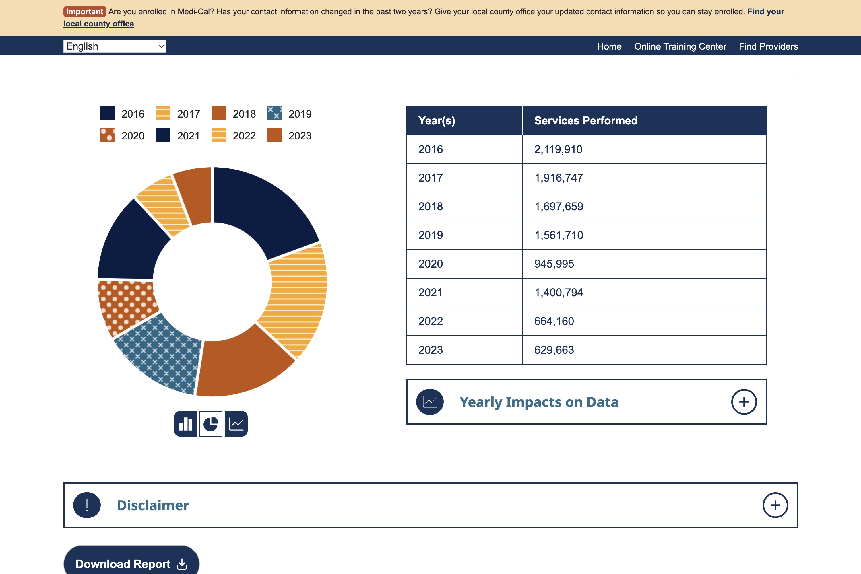
The California Department of Health Care Services needed a powerful dashboard for Family PACT program data. This meant tracking sexual and reproductive health services across the whole state (50,000+ records) with filtering by metrics, counties, demographics, and years.
The tricky part was that they wanted all of this inside their existing WordPress setup, while meeting strict privacy and accessibility rules for government healthcare data.
🧩 Solution Architecture
I leaned on WordPress’s built-in React integration. By properly enqueueing React and using wp_localize_script, I could inject data securely without hacking around their system. That gave me React’s state management muscle, while still taking advantage of WordPress’s security and content workflow.
The design processed everything on the client side with pre-anonymized datasets. That way, sensitive data stayed safe, but the dashboard stayed interactive.
🛠️ Technical Approach
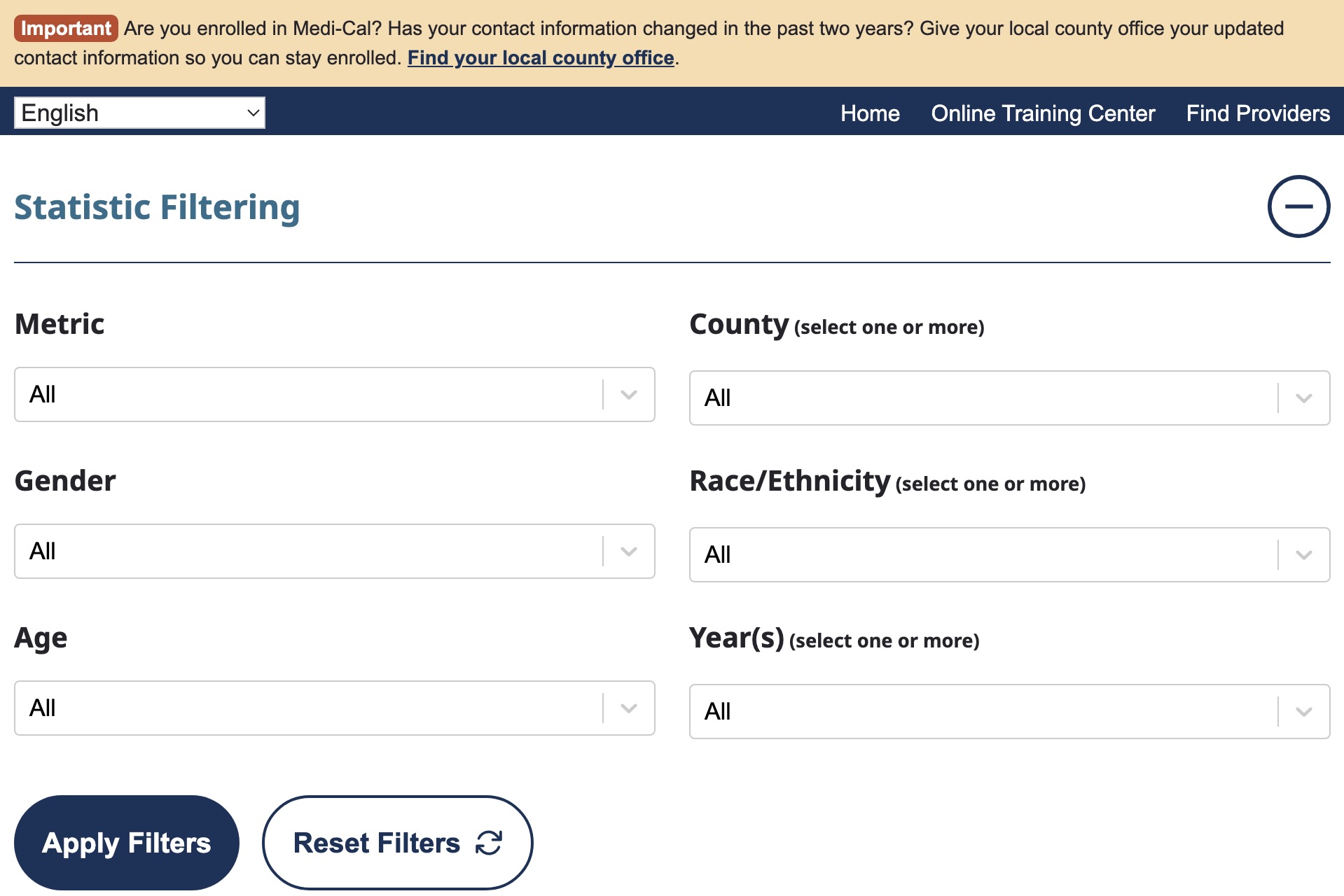
The data architecture was the real complexity. I needed to handle six different filter types simultaneously. These included metrics like office visits, chlamydia screenings, and Long-Acting Reversible Contraception (LARC) services. Then all 58 California counties, gender, race/ethnicity, age groups, plus fiscal years from 2017 to 2023.
I used React's useEffect plus state management to coordinate real-time updates between charts, tables, plus filter controls. Each filter change triggered efficient data transformation pipelines that could handle any combination of filters with sub-second response times.
For privacy compliance, I implemented data masking for small population sizes to protect individual privacy. This was especially important for minors and small counties with very small populations. The PDF export feature was built completely from scratch. I captured chart canvas elements plus formatted them to meet government reporting standards.
🎯 Impact
The dashboard hit all WCAG AA compliance marks. State officials could now slice and dice complex data and export it into clean, report-ready PDFs.
Best of all, it fits right into their existing workflow. No new infrastructure. No disruptions.
💡 Conclusion
This project reinforced that sometimes "good design" from a technical perspective is not what the client needs. They needed charts that communicated clearly to state officials and could be easily exported for reports. Not necessarily the most sophisticated data storytelling.
It also demonstrated the power of choosing the right integration strategy. By using WordPress's standard React patterns, I delivered sophisticated interactive functionality without fighting against existing infrastructure. The state management complexity would have been a nightmare in vanilla JavaScript. React was absolutely the right tool for this level of coordination.